


SOLARFICTION LOGOS (excluding the unholy cross)
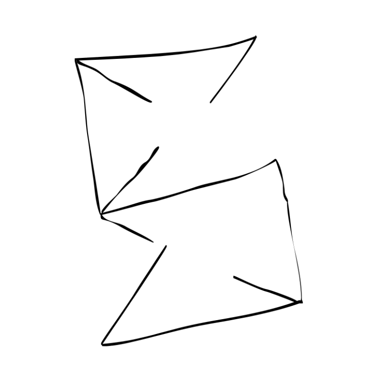
the cool S
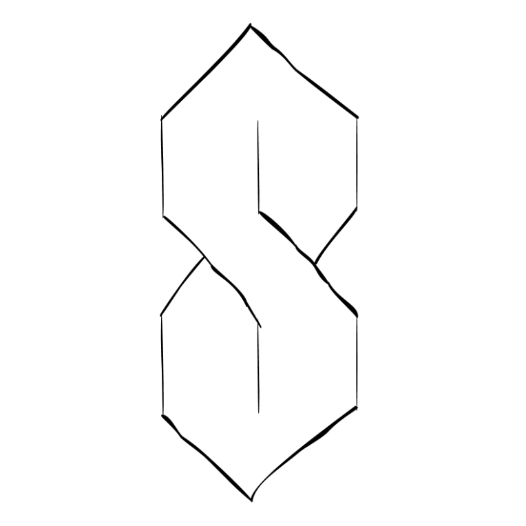
the very first logo, used since 2024. mainly used for the channel and its branding. its a simple popular shape, originated that i used to draw it a lot until i repurposed it for solarfiction
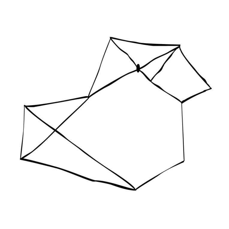
the holy cross
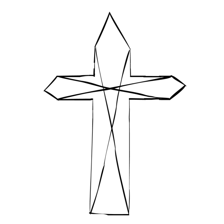
a fairly newer logo, more original. despite also being used in branding, it (could) find its way in my art pieces way more than the cool S, aswell as the fan works. originated from the fact that i am a christian catholic
the golatue
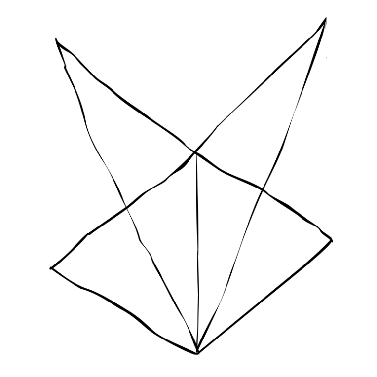
a new logo. its used as a custom symbol for the male gender. it originates from the solarforums slang a few people actually use, "golden statue erected in gold", "golden statue", or simply "golatue" is a term people generally use to call themselves good/great/the best, etc. often paired with its opposite, "sand particle" – a term used in arguments, calling someone bad/horrible
the seventh cookie
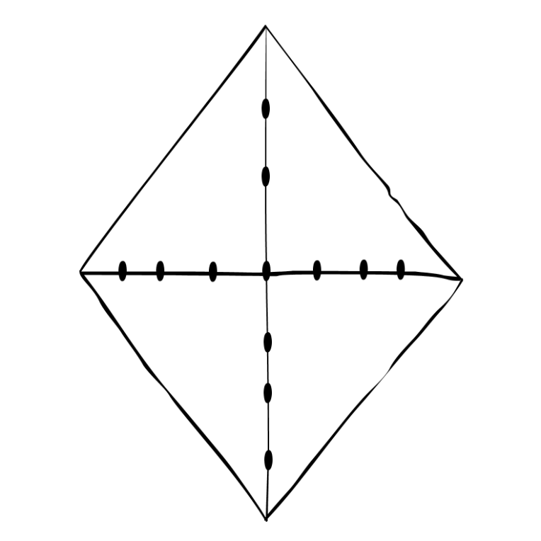
new logo. used as a custom symbol for the female gender. it originates from solarforums slang, "baguette" – simply meaning to like something, someone. "pretzel" – simply meaning to dislike something or someone. theres been a rare term used, "cookie" by a small group within the site, since many forums also have the option to give the user a thanks, rather than a like or dislike. its considered to be way greater than a like to many
the guinea pig
new logo. its used mainly for the stuff i own, also somewhat of a solarforums term, usually meaning to be a guinea pig is to belong to someone. originated from the fact i own guinea pigs
the tilted S
new logo. rarely used for miscellaneous things and documents. originated from my physics assignment
dacylinder17
nice:3 me rocking a holy cross shirt :
also, could you make a version of the seventh cookie so i can use it as a pfp? thankzz
solarfiction
well, im flattered lolyeah hold on homie